Week 9 – Marketing and PR

Analysis of example press release:

Catchy headline which says a lot with a few words.

The supporting quote ads another layer of sincerity and personality to the press release.

Needs a more direct call to action, the contact details at the bottom seem very optional.

Haven’t written a description of their company, even a sentence or two would improve this.

Draft press release:

Don’t just DREAM about those iconic film destinations, see them for yourself

A fresh new app connecting you to the cinematic world

Description

Download our app now to see for yourself!

(We will release this in film magazines such as Sight & Sound and Empire, and travel magazines like Wanderlust, National Geographic Traveller and Lonely Planet.)

Week 8 – Habit-Forming Products

Duolingo

How is the app promoted?

The app is promoted as a fun and effective way to learn a new language online and for free.

What habit-forming features are highlighted and any others you can detect?

You are firstly greeted with the external trigger of a log-in box and following that several language lessons which encourage you to begin them in bright colours. The basic app is free which means you don’t have to spend any money, unless you would like to move to Duolingo Plus which offers further benefits for the paying user. The app is very easy to understand and operates smoothly requiring minimal effort. Non-routine: to complete your daily goal you can choose to have a short daily goal so that it only takes ten minutes if you don’t have a lot of time (or you can make it longer if you do), but this allows a realistic goal and increases the chances you are going to keep coming back every day if the task is manageable and doesn’t disrupt the user’s usual routine, and instead becomes part of it.

What sort of triggers and rewards do you notice in the site and on the apps?

The Tribe: You can add friends and see each others scores and streaks and what league they’re in which means there is a competitive element.

The Hunt: You are able to scroll up and down through the various levels and challenges which shows you what you have completed and what is to come next the further and more you complete. You are able to see what you can get and are therefore motivated to complete that challenge, as well as gather the ones you have already completed.

The Self: It is very clear when you have achieved the full challenge or level and the icon transforms into a a shiny gold one once you’ve completed the full thing. You also have a streak, which allows you to move up a ‘league’ as well as having a daily goal to achieve and appearing on the week’s leaderboard, where you can see other random users who are at the same level as you. The threat of losing your streak and subsequently moving down a league motivates the user to return every day, as well as getting push notifications in many forms from the app to remind you.

How might the concept of the ‘tribe’ ‘hunt’ and ‘self’ help in considering the appeal and habitual use of your app?

In terms of the Tribe / the social aspect of our app, this is something we haven’t delved into at all. There is the possibility of sharing what flights and tours you have booked, as well as a type of ‘favourites’ list of films and their places you wish to visit, which could be seen by others.

The Hunt is a large part of our app as we consider the searching through destinations and looking into them all an important part and for some users it can be the sole purpose for downloading our app.

The Self part of our app is also something that needs further work, we need to make the booking and tickets part of our app something of an achievement which I don’t think will be too difficult.

What problems will your app solve for users?
Letterboxd

How is the app promoted?

The app is promoted as a fun and effective way to review and rate films as a social media platform or just as a private platform.

What habit-forming features are highlighted and any others you can detect?

You are firstly greeted with the external trigger of a log-in box and following that a search engine and a ‘news’ page for the home screen where you can read new articles about new films. The app free which means you don’t have to spend any money. The app is very easy to understand and operates smoothly requiring minimal effort.

What sort of triggers and rewards do you notice in the site and on the apps?

The Tribe: There isn’t anything relatable to this, except following people/adding friends/

The Hunt: n/a

The Self: n/a

How might the concept of the ‘tribe’ ‘hunt’ and ‘self’ help in considering the appeal and habitual use of your app?

In terms of the Tribe / the social aspect of our app, this is something we haven’t delved into at all. There is the possibility of sharing what flights and tours you have booked, as well as a type of ‘favourites’ list of films and their places you wish to visit, which could be seen by others.

The Hunt is a large part of our app as we consider the searching through destinations and looking into them all an important part and for some users it can be the sole purpose for downloading our app.

The Self part of our app is also something that needs further work, we need to make the booking and tickets part of our app something of an achievement which I don’t think will be too difficult.

What problems will your app solve for users?
Week 5, Session 1 – App Homescreen

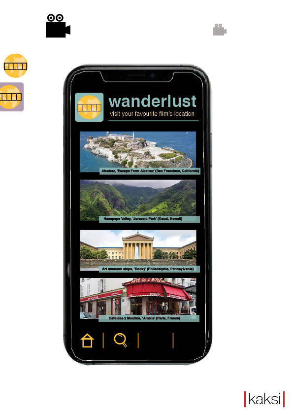
For the first session, we worked on finalising our app logo with a few changes made to adapt to our new pastel colour scheme of blues and yellows. We came together and decided that we didn’t quite like our first initial idea for a logo. We wanted to keep the theme of having the Earth in the background because of the aspect of travelling within our product. We eventually finished our app logo and then started creating our app name, with the app home screen.

With the app name we had to brainstorm a few ideas because we had to think of a name which was simplistic yet catchy. We had the idea of having something related to the word location, because that is the main point of our app. We came up with using the word ‘wanderlust’ meaning the love and need to travel as the name. The name also has an ethereal feeling to it too which made it seem magical, which relates to having a ‘magical’ feel to it.

We finally started to make our home screen, we wanted something that looked aesthetically pleasing but also edgy and straight to the point. We know we wanted our app name and logo right at the top so that it is straight to the point and the first thing you see when the home screen loads up. We then wanted something pretty basic for our tagline – ‘visit your favourite film’s location’ so that the user knows exactly what the app is about. The home screen also has the pictures of the film locations and a small description of what it is and where it is, the user would be able to click on this to find out more about it and book tickets for it. The user would be able to scroll all the way down and the same sort of features would come up, a new place with a description etc. We also have a bar at the bottom of the screen which is inspired by the bar on the Trainline app. This will feature a home screen icon, a search icon, a my tickets icon and a my account section. This is all accessible to the user with minimalistic icons that will take the user to the section of the app that they require access to.

Week 4, Session 2 – Project Management

What key project management concepts and tools match the following definitions?

SWOT Analysis

Structured analysis of the strengths, weaknesses, opportunities, and threats of a product, brand, project, or organisation.

Stakeholder Management

The process of identifying the individuals or groups that are likely to affect or be affected by a project, and sorting them according to their likely impact.

Action Planning

A document that lists what steps must be taken in order to achieve a specific goal.  

Gantt Chart

A type of bar chart that illustrates a project schedule.

Scope Management

The application of processes, methods, knowledge, skills and experience to achieve the project objectives.

What project management concept, tool or technique covered in this session do you think is most useful and why? 

Whilst they all have their own particular strengths I think the most useful of all is the SWOT analysis as from this you can cover a wide range of potential problems, as well as things that will be gained and provides a great starting point which then feeds into all the other project management concepts.

How might you apply project management tools to your own projects?

We would use the SWOT analysis when looking at our strengths, weaknesses, threats and opportunities. For example, we would combine together what we think works within our app when creating the home screen. We would take the opportunity to carry out our research by looking at current apps that fit in with our ‘theme’ and seeing how they look visually and adapt to those designs.

Week 3, Session 2 – Logos

In this session we discussed logos and the importance of a distinct and recognisable logo, the most important part of an effective logo being it’s scalability. We looked at several different logos from large companies and considered what about them made them good logos and how company logos have evolve through time.

Four logo types:

Wordmark logos are often simple, versatile and encourage recognition of the company and their brand name. (E.g. Pinterest, Coca-Cola, Amazon and FedEx.)

Pictorial logos are usually more visually engaging than word mark logos, often very simple and ‘say what you see’. It is also often easier to make (subtle or drastic) changes. (E.g. Target, Ghostbusters and Final Cut Film Festival.)

Abstract Iconography logos offer more room for interpretation with iconography not based on realist representation. They breed familiarity quickly, stand out easier and are harder to imitate but need meanings applied or associated to them to work. (E.g. Pepsi, Adidas and Touchstone Films.)

Finally, Logo Systems require a logo that can be adapted, manipulated stylistically and need the versatility to change context(s). (E.g. MTV, Google info-gram, Hillary Clinton ‘H’.)

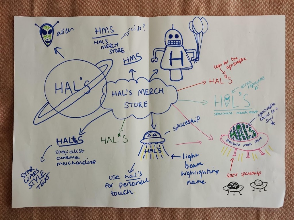
Later we picked a random company and were tasked with making a new logo for them. We picked Hal’s Merchandise Store, a specialist provider of film related toys and paratextual paraphernalia, with a core market of Science Fiction related products. Our first thought was to simplify the name to ‘Hal’s’ making the name stand out and giving the store a personal touch. We also knew we wanted to include the words ‘specialist merchandise store’ to provide more information and highlight that it is no ordinary toy store.

To relate the logo to Science Fiction and merchandise we explored many different images that are associated with Science Fiction such as planets, aliens, robots and spaceships and decided on a cartoon-style spaceship/UFO, with ‘Hal’s’ in large letters filling the dome part of the UFO and the word’s ‘specialist merchandise store’ below that (bottom right sketch).

Week 3, Session 1 – App Icon & Homescreen

This week we began to design the app icon and developed some preliminary ideas. We began to develop other ideas for the company name and the design.

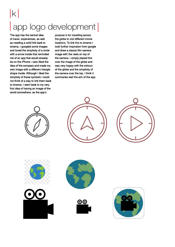
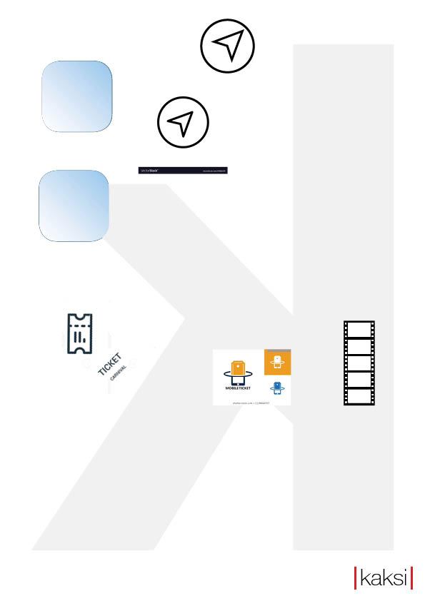
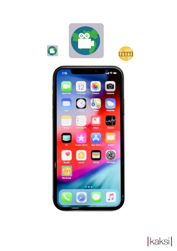
We chose an app template from google and from there learnt how to change the colour of the image and also how to give the box corners to fit the image. We then started to think about what we would put inside this template and by googling some images we found simplistic ideas, such as a compass, a map arrow and a ticket/film strip combination.

We also organised the page to the left of the iPhone which will display text and describe our app.

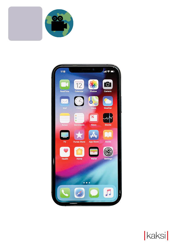
We then added some more pages by duplicating the previous two. To this we chose and added a high resolution image of an iPhone, to test out what our app icon would look like on the real thing. We curved the corners of the image to fit the shape of the iPhone and then placed our initial app icon design over the top, to see how it would look.

Week 2, Session 1 – Indesign Basics

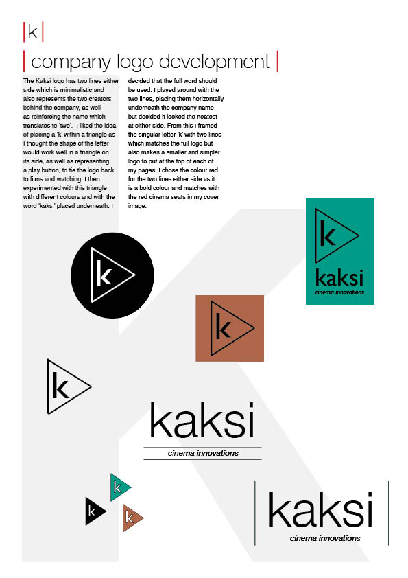
This week we focused on learning the basics of Indesign, such as placing an image and inserting/downloading fonts from external websites. We also learned how to distort images and create new pages. We also created our company name, ‘Kaksi’ meaning ‘two’ in Finnish. We decided to focus on the idea of being a duo and that being the prominent look for our logo. We also discussed ideas for our app development and getting those first initial thoughts down so that we can then develop them into something further as the weeks go on.

Week 2, Session 2 – Worksheet, Mission Statement & Company Values

Website 1 – Alphapanda

How would you evaluate the ways in which these companies/organisations present themselves? What is the overall look and feel of their on-line material? The website feels professional but invites interest with the large colourful images sliding across the page. Throughout the website you get an inclusive feel, with the words ‘we are alpha panda’ introducing you to the page and as you scroll they provide further information about the company and detailed insights into the employees.

To what extent do they utilise social media effectively? In terms of social media, they promote their pages on the website and use their own hashtag #pandaquotes to encourage people to interact with the page and add another opportunity for customers to feel valued and listened to.

Website 2 – The Solid State

How would you evaluate the ways in which these companies/organisations present themselves? They have their tagline on the homepage in bold letters to let the user know what the website is about. “We make impactful film trailers that excite audiences“. This gives an exact description of the websites intent. When you scroll further down it shows you what critics say about the website, so you know that it has some legitimacy to it. This includes being Australia’s most awarded film marketing agency. It clearly takes pride on being such a well-thought-of company to the masses, and it wants you the audience to know that.

What is the overall look and feel of their on-line material? The website comes across already as a visual experience from the first initial look when loading up the website. Visually, it is a very attractive and eye catching to the audience. It gives a cinematic experience already from just seeing the website. The homepage is clearly designed to replicate a film poster, so that from then you know exactly what the website is regarding.

To what extent do they utilise social media effectively? They don’t really stand out with their social media, on the website they have their links at the bottom of their page to their social media. When you go on their Facebook, they tend to post monthly when they have any updates and you can make appointments with them through their website. Yet again, it is the same process on their Twitter except you can’t make appointments on there. With their Linkedin, YouTube and Vimeo, it is the same process with just the updates and a brief overview. They don’t tend to focus so much on the social media aspects of things.

Website 3 – Think Jam

How would you evaluate the ways in which these companies/organisations present themselves? What is the overall look and feel of their on-line material? At first glance the website page feels cluttered, with pictures of film posters consuming the entire page. Like Alpha Panda they use inclusive, personalised words such as ‘we’, ‘our’ and ‘us’ and suggests a successful and cooperative team behind the company. Their blog provides an extra dimension to the website which is current and interesting. They seem to promote themselves as successful and encourage jobs with the company, rather than pushing their social media as much as Alpha Panda does.

To what extent do they utilise social media effectively? Whilst their website does not seem to promote their social media pages their Twitter feed is current and relatable whilst also being professional and informative about the company.

Mission Statement – ‘We aim to provide quality experiences and services to inspire and encourage lovers of cinema.’

Our Company Values

Kaksi’s name derives from the Finnish word for ‘two’ and from the outset, the idea of unity and that we as humans are always better together has formed the basis of our aspirations. We aim to bring people together by the universal love of motion pictures and open a gateway into the world of cinema.

  • Quality
  • Teamwork
  • Honesty
  • Fun

Create your own website, free on WordPress.com.Create your own website.
Start free